Stats in a nutshell part 1: Discomfort and Description

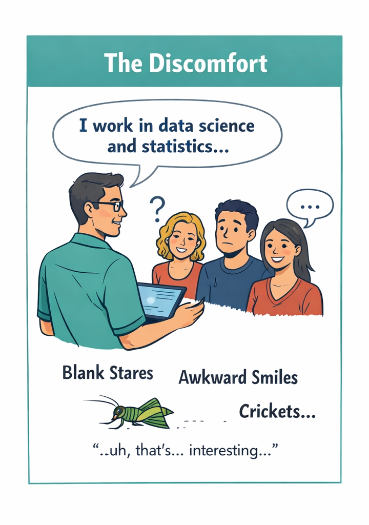
The Discomfort
If you’ve ever asked someone what they do for a living and gotten an answer like “I work in statistics” or “I do data science,” you’ve probably seen the look: a blank stare, or the polite smile that means “that sounds complicated and I’m not sure I want to know more.”
There is a small discomfort that people in the science and data world feel in those moments. Not because the work is unimportant—but because it’s hard to explain without sounding either arrogant or vague. And yes, some people do make their jobs sound more complicated than they are. But in the case of statistics and data, that isn’t really necessary. This stuff is complicated even when you try to be clear.
You’ll often hear people say you don’t need a PhD—or even a degree—to understand statistics. That part is true. But that sensible idea often mutates into something much more dangerous:
“Education doesn’t matter,” or “What do scientists really know anyway?”
As a society, we depend on people who are trained to collect data, check it for errors, and—most importantly—interpret what it means. Those interpretations guide everything from medical advice to public policy. In this short series, Stats in a Nutshell, I want to show what statistics actually do, how they’re commonly used, and where they so often go wrong.
Let’s start with the term "average", which is part of the most familiar and most misunderstood category of all: descriptive statistics.
Averages
Descriptive statistics are the most used—and abused—tools in all of data science; none more so than averages.
Most of us meet them in school as mean, median, and mode. They feel like simple arithmetic, not “real statistics.” But they are statistics, and they quietly shape how we think about nearly everything: intelligence, health, income, risk, and success.
The problem starts when we confuse the word “average” with “normal.”
If someone is told they have an “average IQ,” it often feels like an insult. We all want to be exceptional, and average sounds like ordinary. But average compared to whom? Most people on Earth have never taken an IQ test. Different countries use different tests. Even within one country, results vary widely by region, age, and education.
The number sounds precise—but the comparison behind it is fuzzy.
The same thing happens with more personal measurements, like weight and body fat. In 2014, the average BMI in the United States was about 28.8. In the UK it was 27.3. In Japan it was around 22.6. Those are big differences. But what do they actually mean?
If higher BMI predicts worse health outcomes (and, unfortunately, it does), then being “average” in one country may carry far more health risk than being “average” in another. The word hasn’t changed. The implication has.
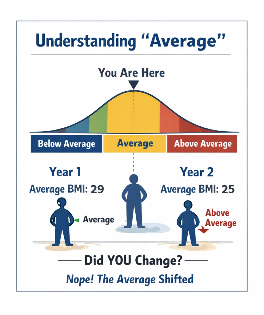
Now imagine this: public health policy in the U.S. suddenly improves. Healthier food becomes cheaper. The national average BMI drops. You, however, don’t gain or lose a pound.
One year you’re “average.”
The next year you’re “above average.”
Did your health suddenly get worse?
Of course not.
This is the trap of descriptive statistics:
The statistic changed. The reality didn’t.
Averages, medians, and percentages don’t describe you. They describe your position relative to everyone else. When the group shifts, your label shifts—even if nothing about you has changed.
That’s why the word “average” is so dangerous when it appears in headlines. Every time you see it, ask:
Average compared to whom? Over what population? And what does that comparison really imply?
Descriptive statistics like averages are incredibly useful. But without context, they quietly distort how we see ourselves and the world.
And that’s just the beginning.