Stats in a nutshell part 4: Correlation Crossroads

If you are not part of the data science community, and you hear one of us casually drop a line like "Correlation does not equal causation, y'know..." and you feel the instinct to roll your eyes and ignore whatever they say next... I hear you. What I would ask is that you hold that reaction for a moment and try to hear us out, even if the delivery can be mildly annoying.
And if you are a member of the data science community, and you throw out that line with the air of having just revealed the nature of universe – do us all a favor and stop doing that. “Correlation ≠ causation” has become a slogan, and slogans stop being useful when people feel scolded by them.
I will, on occasion, hear someone in academia or data-driven work give a presentation, provide a measure of correlation, then hedge themselves with “I know, I know, correlation doesn’t equal causation,” before anyone has a chance to object. That actually makes sense. Many presenters are tired of defending themselves against reflexive criticisms and “gotcha” moments, so they feel obliged to preemptively explain what they do and don’t mean the moment correlated outcomes appear on a slide.
But for most people outside that world, the phrase has started to wear thin. So instead of repeating the slogan, let’s talk about what correlation is actually good for, how it can relate to cause, where it goes wrong, and what we should reasonably do with the information it gives us.
What is Correlation actually good for?
A correlation metric such as Pearson’s r or Spearman’s rho is a number that tells us two things:
(1) how strongly two variables tend to move together, and
(2) whether they move in the same direction or opposite directions.
That’s it—that’s all correlation tells us.
For example, consider solar panels. In warmer weather, they often produce more electricity; in colder weather, they often produce less. Air temperature might be measured in degrees (°F or °C), while electricity output might be measured in watts or kilowatts.
Suppose that for every 1°F increase in temperature, a solar panel produces somewhere between 1 and 3 more watts, and for every 1°F decrease, it produces 1–3 fewer watts. At very low temperatures, the panel might produce no electricity at all—and since it can’t produce negative electricity, the relationship flattens out.
In that situation, the correlation between temperature and energy output would likely be fairly strong, perhaps around 0.8 on a scale from −1 to 1. Because the value is above zero, the relationship is positive: when one variable increases, the other usually does too. The correlation isn’t perfect (1.0) because the increase isn’t exactly the same every time and because the relationship breaks down at low temperatures.
Importantly, this does not mean temperature causes solar panels to generate electricity. Solar panels operate on sunlight, not air temperature, and they can function perfectly well in very cold conditions if enough sunlight is available. The reason temperature and energy output are correlated is that more sunlight tends to increase both.
In a nutshell: temperature does not cause solar panels to produce energy, but because sunlight influences both temperature and output, the two measures are often highly correlated.
The take-home message:
Once you see correlation this way, it stops being either magical or meaningless. A strong correlation is telling you that two things are moving together in a reliable way. That alone is valuable information. It narrows the field. It tells you where to look more closely.
What correlation does not tell you is why that relationship exists. That requires additional evidence, different study designs, or controlled experiments — things that are often expensive, slow, or simply impossible in the real world. This is why correlation shows up everywhere in science, policy, and journalism: it’s often the best signal we can get.
The mistake happens when we treat that signal as a conclusion instead of a clue.
In everyday life and in the news, correlations are usually the opening chapter of a story, not the ending. They tell us something interesting is happening, but not what action we should take or who deserves the credit or blame. When those extra steps are skipped, correlation starts carrying more meaning than it was ever designed to hold.
So, the next time you see a headline linking two trends, resist the urge to either believe it completely or dismiss it out of hand. Ask what else might be influencing both, what would have to change to prove cause, and what assumptions are being left unsaid.
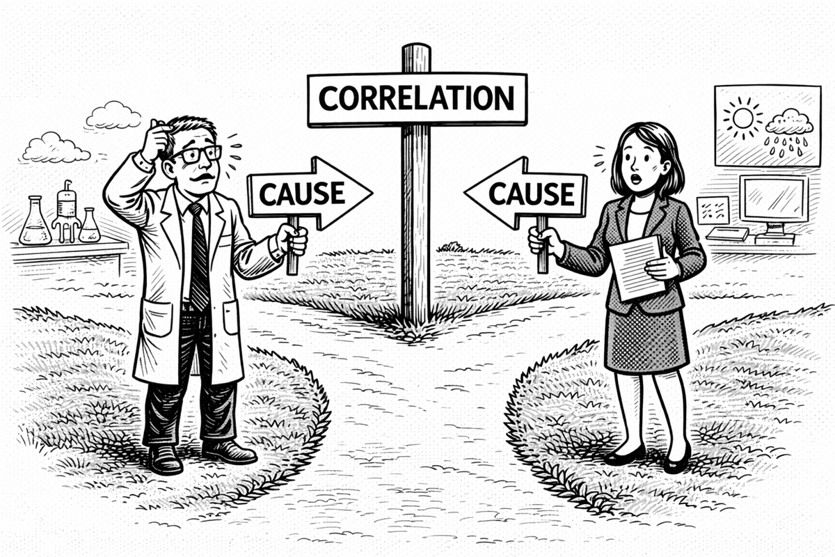
Correlation isn’t a trick. It isn’t a punchline.
It’s a signpost — useful, directional, and easy to misuse if you forget what it’s pointing toward.